Helpful information ...

Moxy Web - How to Design Responsive Websites: A 2026 Guide
28.06.2026

How to Design Responsive Websites: A 2026 Guide

Learn how to create responsive design that works on all devices. Improve user experience and increase search engine visibility.

How to Create Adaptive Design: 2026 Guide


In brief:

  • Adaptive design enables website content and layouts to automatically adjust for every device. It uses tools such as CSS media queries and container queries for modular and dynamic design. It works closely with cross-device testing strategies and provides a better user experience as well as higher visibility in search engines.

Adaptive design is an approach to designing websites and applications in which content and layout automatically adjust to every device, from mobile phones to desktop computers. In the industry, this is commonly known as responsive design, although adaptive design in its broadest sense also includes dynamically adjusting content based on visitor behavior. Since mobile devices dominate as the primary way people access the web, adaptability is now essential for strong search engine visibility and visitor satisfaction. Without it, you lose visitors before they even read the first line.

How to Create Adaptive Design: Tools and Technologies

The difference between responsive and adaptive design is important. Responsive design adjusts the layout according to the screen width. Adaptive design goes a step further: content changes dynamically based on visitor behavior, location, or the stage of the customer journey they are in. This means that two visitors on the same page may see different content because the system recognizes their individual needs.

To implement adaptive design, you need the following tools and techniques:

  • CSS media queries: the foundation of every responsive design. Define breakpoints at common widths such as 480 px, 768 px, and 1200 px, and create different layouts for each.
  • CSS container queries: a newer technique that adapts components to the width of their container, rather than the entire screen. A card in a sidebar behaves differently from the same card placed in the main content column.
  • Prototyping tools: Figma and Adobe XD allow you to quickly test layouts for different devices before development begins.
  • Testing tools: Google Chrome DevTools, BrowserStack, and Lighthouse verify how your site performs across different devices and connection speeds.
  • Adaptive content: a system that displays different messages based on visitor data, such as showing a different call to action for a new visitor than for a returning one.

Expert tip: Start with Google Chrome DevTools and test your website at a width of 375 px. If the content is readable and the buttons are easy to reach with your thumb, you're on the right track.

Adaptive content is frequently used in advanced email campaigns and web applications, where dynamic adjustments increase visitor engagement. It's not enough for a website to simply look good on a phone. The content must also make sense within the context in which the visitor is viewing it.

Overview of the key steps for creating adaptive design in an infographic

How to Plan Adaptive Design Step by Step

A structured approach is the difference between a website that truly works and one that merely happens to display on a phone. Follow these steps:

  1. Start with a Mobile-First approach. Design for the smallest screen first. If content doesn't fit on a mobile screen, you probably don't need it on desktop either. Mobile-First is not just a technical requirement—it is a business decision that improves both UX and SEO at the same time.

  2. Define the content hierarchy. Decide which elements are most important. On mobile devices, display only the essentials: the headline, the key message, and the call to action. Secondary content can appear on larger screens.

  3. Use CSS Grid and Flexbox. Grid is ideal for two-dimensional layouts, while Flexbox is best for aligning elements in a single direction. Together, they cover most layout requirements.

  4. Implement container queries for modular components. Style elements based on the size of their containing element rather than the screen itself. This ensures the same component functions correctly regardless of where it appears on the page.

  5. Build modularly. Design every element—buttons, cards, navigation—as an independent component. Modular design reduces code duplication and makes future maintenance much easier.

  6. Test continuously, not just at the end. After every major step, verify the results on at least three different devices or emulators.

A comparison of layout techniques helps you choose the right tool for each scenario:

Technique Best suited for Advantage
CSS Flexbox Rows and columns in a single direction Simple element alignment
CSS Grid Complex two-dimensional layouts Precise grid control
Container queries Modular components Adaptation based on the container
Media queries Global breakpoints Overall page responsiveness

Expert tip: When designing components, assume each one will eventually be used in a different context. If you build it to work independently, you'll save hours of work during future redesigns.

For adaptive websites without compromise, modularity is a foundation, not an optional addition.

How to Improve User Experience with Adaptive Design

Adaptive design directly influences whether a visitor stays on your website or leaves. Loading speed is the first filter: a slow website drives visitors away before they even see the content. Google considers Core Web Vitals when ranking websites, with LCP (Largest Contentful Paint) and CLS (Cumulative Layout Shift) being especially important for adaptive websites.

For a great web user experience, follow these principles:

  • Typography: On mobile devices, use a font size of at least 16 px for body text. Smaller fonts strain readability and increase bounce rates.
  • Navigation: The hamburger menu is the established standard for mobile devices, but make sure menu items are large enough for comfortable touch interaction (at least 44 × 44 px according to WCAG guidelines).
  • Colors and contrast: The contrast ratio between text and background should be at least 4.5:1 under the WCAG 2.1 standard to ensure readability for all visitors.
  • Images and media: Use the WebP format and the srcset attribute so browsers load images at the appropriate resolution for each device.
  • Adaptive content: Dynamically adapting content based on visitor behavior increases conversions more effectively than static personalization.

Adaptive design is not just a technical challenge. It is a design decision that tells visitors: we understand where you are and what you need.

Regular testing is the only reliable way to verify quality. Testing across different devices ensures a consistent experience and prevents issues that simply aren't noticeable when developing on a desktop computer. Test your website on both iOS and Android devices, across multiple browsers, and under slow mobile network conditions.

The latest 2026 user experience trends show that visitors expect instant responsiveness and flawless performance across all devices. Slow loading or inconsistent interface elements are no longer just inconveniences—they are reasons for users to leave.

Which Mistakes Commonly Ruin Adaptive Design?

Most problems with adaptive design stem from mistakes that can easily be avoided with proper planning. Understanding these pitfalls will save you both time and money.

  1. Ignoring the Mobile-First approach. Designers often start with the desktop version and then shrink it for mobile devices. The result is an overcrowded mobile page filled with elements that don't belong there. 99% of users access digital menus via smartphones. That number clearly shows that the mobile experience is not secondary—it's the primary one.

  2. Insufficient testing across different devices. A browser emulator is not a substitute for a real device. Test on at least two physical devices running different operating systems.

  3. Overly complex CSS. Disorganized styles with deeply nested selectors make maintenance difficult and slow down loading times. Write modular CSS and avoid duplicating rules.

  4. Ignoring modularity. Common mistakes include insufficient modularity and inadequate testing, resulting in changes to one element breaking the layout of another. Every component should remain independent.

  5. Poor management of adaptive content. Showing the same content to every visitor, regardless of their device or behavior, is a missed opportunity. Adaptive content that responds to visitor context increases engagement and conversion rates.

For a 2026 SEO growth strategy, adaptive design is one of the foundations—not merely an aesthetic decision.

Key Takeaways

Hands testing responsive design on a tablet device.

Adaptive design requires a Mobile-First approach, modular components, and regular testing across different devices to deliver a high-quality experience for every visitor.

Key Point Details
Mobile-First as the foundation Start by designing for mobile devices, then expand to larger screens.
Container queries for modularity Use container queries so components adapt to their containers rather than just the screen.
Testing on physical devices Verify your website on both iOS and Android devices, not just in browser emulators.
Adaptive content improves conversions Dynamic content that responds to visitor behavior outperforms static personalization.
Modularity simplifies maintenance Independent components reduce code duplication and make future updates faster.

My Experience Designing Adaptive Solutions

When I first worked on a project where the client required complete adaptability across five different device types, I quickly realized that technical knowledge alone wasn't enough. The biggest mistake I see among business owners and designers is treating adaptive design as a one-time project. They make a website responsive once and assume the job is finished.

The reality is different. Adaptive design is a living system. Devices evolve, browsers gain new capabilities, and visitors bring new behaviors. Container queries are a great example: three years ago, most developers hadn't even heard of them; today, they're a standard tool for anyone serious about building modular interfaces.

What years of working on web projects have taught me most is that investing in adaptive design at the beginning of a project is always cheaper than fixing problems later. A website built modularly from day one and tested across different devices requires significantly less maintenance. Clients rarely understand this at first, but once they see that updating content no longer breaks the layout, they quickly become strong advocates of this approach.

My recommendation: don't cut corners on testing, and don't skip the Mobile-First phase. These are the two decisions that determine the quality of everything that follows. Also take a look at UX design best practices for additional guidance that's often overlooked in day-to-day work.

— Ziga

Moxy-web: Your Partner for Adaptive Web Solutions

Moxy-web develops websites, online stores, and web applications that perform flawlessly across all devices. Every project is built on a Mobile-First approach, modular design, and thorough testing across different platforms, ensuring an excellent experience for every visitor. In addition to development, Moxy-web also offers web hosting, domain registration, graphic design, and technical support. Every solution is tailored to the unique needs of each client—never based on generic templates. If you're looking for a web presence that grows alongside your business, explore the services available at moxy-web.com and discover how we can build a solution that aligns with your business goals. For additional design inspiration, take a look at creative design examples for 2026.

Frequently Asked Questions

What Is Adaptive Design and Why Is It Important?

Adaptive design is an approach in which a website or application automatically adjusts to every device. Without it, you lose both visitors and search engine visibility.

What Is the Difference Between Responsive and Adaptive Design?

Responsive design adjusts the layout according to screen width, while adaptive design also dynamically changes content based on visitor behavior and context.

What Are Container Queries and Why Should You Use Them?

Container queries are a CSS technique that allows a component to adapt based on the width of its container rather than the entire screen. This improves modularity and flexibility in complex layouts.

How Do I Test Adaptive Design Across Different Devices?

Use Google Chrome DevTools for quick emulation, then verify your website on at least two physical devices running different operating systems to ensure reliable results.

Does Adaptive Design Affect SEO?

Yes. Google considers both the mobile user experience and Core Web Vitals when ranking websites. A site that is not optimized for mobile devices will perform worse in search results.

Recommended Reading

Moxy Web - Hire an agency or develop in-house?
Hire an agency or develop in-house? Consider costs, speed, expertise, and risks, and choose a model that supports your company's growth.
Moxy Web - What is a domain and why every business needs one
Discover what a domain is and why every business needs one. Gain the knowledge to build a strong online identity.
Moxy Web - Why a business needs a web application
Why does a company need a web application? Because it speeds up processes, connects systems, reduces manual work, and prepares the company for growth.
Archive
3. 7. 2026
Hire an agency or develop in-house?
3. 7. 2026
What is a domain and why every business needs one
2. 7. 2026
Why a business needs a web application
2. 7. 2026
Why security updates are important in 2026
1. 7. 2026
Content strategy for a business page
1. 7. 2026
Top 4 agency alternatives for novisplet.com 2026
30. 6. 2026
Does a company need its own CMS?
30. 6. 2026
What is Modern Design: A Guide for Businesses 2026
29. 6. 2026
How to choose the right domain for your business
29. 6. 2026
What is a corporate visual identity: a guide for 2026
28. 6. 2026
Overview of online commerce platforms
28. 6. 2026
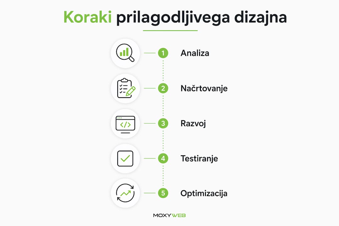
How to Design Responsive Websites: A 2026 Guide
27. 6. 2026
How to choose an online store structure
27. 6. 2026
Marketing checklist for a company's digital presence
26. 6. 2026
Best features for a B2B portal
26. 6. 2026
What is User Experience Personalization: A Guide 2026
25. 6. 2026
Shopify or custom store?
25. 6. 2026
Digital Strategy Creation Workflow: Guide 2026
24. 6. 2026
What does custom development mean in practice?
24. 6. 2026
How technical support works: a guide for entrepreneurs
23. 6. 2026
What are design standards: a guide for businesses
23. 6. 2026
How long does it take to create a store?
22. 6. 2026
How to prepare a brief for a website
22. 6. 2026
UX Design Best Practices for Digital Professionals
21. 6. 2026
Business Systems Integration Guide
21. 6. 2026
Workflow for digital company presentation: guide 2026
20. 6. 2026
Best solutions for content editing
20. 6. 2026
Why choose custom development for your business?
19. 6. 2026
Landing page design that sells
19. 6. 2026
Tips for easily managing content in your company
18. 6. 2026
Purchase funnel optimization that sells
18. 6. 2026
Top 6 alternatives to moxy-designs.com in 2026
17. 6. 2026
Top mistakes in website redesign
17. 6. 2026
Top 6 alternatives to mojaspletka.si agencies 2026
16. 6. 2026
What is included in web hosting?
16. 6. 2026
Benefits of scalable applications for growing businesses
15. 6. 2026
Responsive website design without compromise
15. 6. 2026
The Role of Digital Presence for Business Growth 2026
14. 6. 2026
The Role of Automation in Business: A Guide to 2026
14. 6. 2026
Website user experience counts
13. 6. 2026
Tips for improving your digital presence in 2026
13. 6. 2026
How to prepare content for a website
12. 6. 2026
What is website accessibility: a guide for entrepreneurs
12. 6. 2026
Website maintenance for businesses
11. 6. 2026
Benefits of the Modular Web for Businesses in 2026
11. 6. 2026
Trouble-free maintenance of online systems
10. 6. 2026
Step by step: creating a portal for entrepreneurs
10. 6. 2026
A B2B online store that really accelerates sales
9. 6. 2026
The role of digital strategy for business growth in 2026
9. 6. 2026
Managing website content without chaos
8. 6. 2026
What is an e-commerce platform: a guide for businesses 2026
8. 6. 2026
How to connect an online store to ERP
7. 6. 2026
The Role of Fast Page Loading for Entrepreneurs 2026
7. 6. 2026
Guide to redesigning your business website
6. 6. 2026
Content Editing Steps: A Guide for Businesses 2026
6. 6. 2026
How to improve website conversions
5. 6. 2026
Why use an SSL certificate for a secure website?
5. 6. 2026
A booking system that really saves time
4. 6. 2026
The Role of SEO for Businesses: Growth Strategy 2026
4. 6. 2026
How long does it take to develop a web application?
3. 6. 2026
Web Application Development Guide 2026
3. 6. 2026
Payment system integration for online stores
2. 6. 2026
The Role of Analytics in Digital Business: A Guide to 2026
2. 6. 2026
Website or store - what to choose?
1. 6. 2026
GDPR v spletnem okolju: vodnik za podjetja 2026
1. 6. 2026
How is the development of an online store going?
31. 5. 2026
Top 6 how much does it cost to create an agency website 2026
31. 5. 2026
Online Business Automation Trends 2026
30. 5. 2026
The role of artificial intelligence in the web: a guide to 2026
30. 5. 2026
Website Migration Guide
29. 5. 2026
What is front-end development: a guide for 2026
29. 5. 2026
Online User Experience Trends 2026
28. 5. 2026
Website Design: A Guide for Entrepreneurs 2026
28. 5. 2026
Trends in the development of business portals in practice
27. 5. 2026
List of mandatory online store functionalities 2026
27. 5. 2026
When does it make sense to redesign a website?
26. 5. 2026
What is a landing page and why is it key to sales?
26. 5. 2026
How to design a business website
25. 5. 2026
Website Hosting Guide: Choosing and ManagingWebsite Hosting Guide: Choosing and Managing
25. 5. 2026
How to edit content without a programmer
24. 5. 2026
What is UX on the web: a guide for entrepreneurs
24. 5. 2026
WordPress or custom development?
23. 5. 2026
Individual approach in web development: why it matters
23. 5. 2026
Corporate graphic image price: what influences it
22. 5. 2026
A Guide to Website Design in 2026
22. 5. 2026
Creating a custom website pays off
21. 5. 2026
Website Maintenance Process: A Guide for Businesses
21. 5. 2026
The best functionalities of a business online store
20. 5. 2026
Website Creation Checklist: Guide 2026
20. 5. 2026
Creating online stores for businesses
19. 5. 2026
Website Development: A Practical Guide for Entrepreneurs
19. 5. 2026
Business systems integration without chaos
18. 5. 2026
The most common mistakes in developing web solutions
18. 5. 2026
Website support that really works
17. 5. 2026
Examples of aesthetic website design
17. 5. 2026
B2B portal development guide
16. 5. 2026
Definition of Modern Web Development: A Guide for Entrepreneurs
16. 5. 2026
Pre-built platform or custom solution?
15. 5. 2026
Web application scalability: the key to business growth
15. 5. 2026
How to improve website speed
14. 5. 2026
What is web hosting and how to choose the right solution
14. 5. 2026
A guide to a secure business website
13. 5. 2026
Top 10 online trends for businesses: digital growth 2026
13. 5. 2026
A business website that works for a company
12. 5. 2026
Why test online solutions for business success
12. 5. 2026
Choosing an online store platform
11. 5. 2026
Examples of integrating web tools for efficient business
11. 5. 2026
Graphic design for a company that sells
10. 5. 2026
Step by step to successful web application development
10. 5. 2026
UX design of an online store that sells
9. 5. 2026
What is an online store and how to set one up successfully
9. 5. 2026
Graphic design of the overall image
8. 5. 2026
Investing in a website: The key to business growth
8. 5. 2026
Renovate an outdated website without the guesswork
7. 5. 2026
What is a web application and how does it help your business?
7. 5. 2026
How Website Maintenance Works
6. 5. 2026
Effectively Managing Website Content: A Guide for Businesses
6. 5. 2026
Responsive website for business
5. 5. 2026
What is online branding and how does it improve your appearance?
5. 5. 2026
Custom CMS for your business or off-the-shelf solution?
4. 5. 2026
Business Process Automation with a Web Application
4. 5. 2026
Web architecture: the key to a better online presence
3. 5. 2026
Online store integration with delivery
3. 5. 2026
How to design unique online solutions for business growth
2. 5. 2026
Connecting your online store to your accounting
2. 5. 2026
Explaining modern web applications for business growth
1. 5. 2026
What is e-commerce? Everything SMEs need to know to succeed
1. 5. 2026
Corporate Website Security Without Illusions
30. 4. 2026
Top 4 oxmo.si alternatives 2026
30. 4. 2026
Registering a domain name for your business without mistakes
29. 4. 2026
Static vs. Dynamic Website: What It Means for Your Business
29. 4. 2026
Business Website Hosting
28. 4. 2026
Web Design Trends for a Better Digital Presence
28. 4. 2026
Website Maintenance - Price and Reality
27. 4. 2026
How to Build an Online Store
27. 4. 2026
Top 6 mojbiz.si alternatives 2026
26. 4. 2026
What does building a website involve?
26. 4. 2026
Modern Technologies for Successful Web Development and Growth
25. 4. 2026
When is a custom web application the right choice?
25. 4. 2026
8 Benefits of a Modern Online Store for Business Success
24. 4. 2026
How to Optimize Your Website for Better Results
24. 4. 2026
Creating an online store - price without fog
23. 4. 2026
Why Website Speed ​​Is Key to Success
23. 4. 2026
How much does it cost to create a website?