![Moxy Web - UX design of an online store that sells]()
10.05.2026
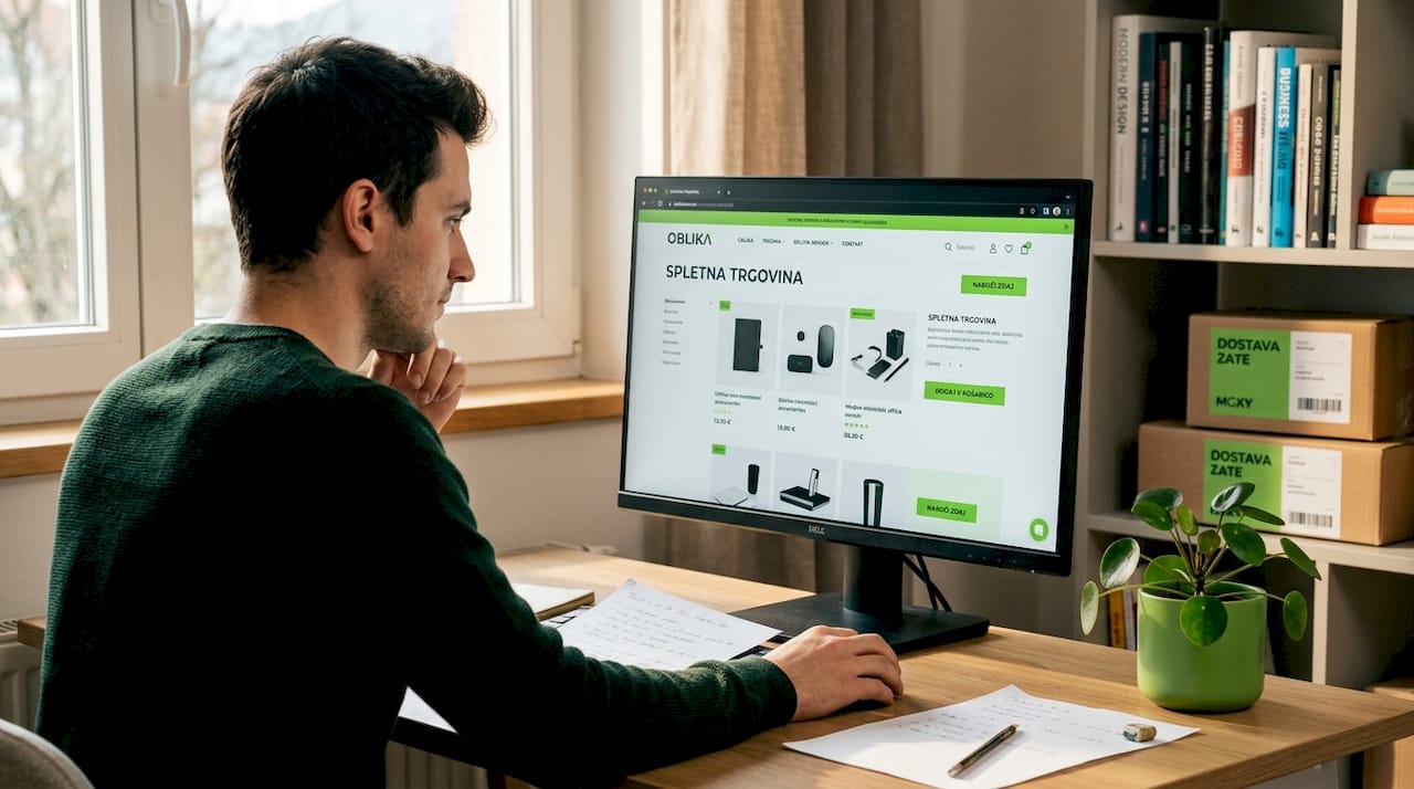
UX design of an online store that sells
Online store UX design impacts sales, trust, and abandonment rates. Find out what really improves the user experience.
A good online store rarely succeeds based on appearance alone. If visitors cannot find the right product, do not understand the offer, or give up during checkout, the design has failed to do its job. That is exactly why ecommerce UX design is one of the most direct investments in higher sales, fewer abandoned carts, and a stronger sense of trust from the very first visit.
Many companies still confuse visual polish with user effectiveness. Both matter, but they are not the same thing. A beautiful interface attracts attention, while good UX guides the visitor smoothly toward action - searching, comparing, adding to cart, and completing the order. If the store is built around your business model, that is an advantage. If it is built around the limitations of a generic template, problems often appear precisely in the user experience.
What ecommerce UX design means in practice
UX is not decoration. It is about how users experience your store from the first click to the confirmed purchase. This includes category structure, filter logic, product presentation, content readability, loading speed, functionality on mobile devices, the feeling of security during payment, and the clarity of the entire process.
Good ecommerce UX design does not try to be interesting for its own sake. Its goal is to make purchasing easy. Users should never have to think about where to click, what a specific button means, or whether their order will actually go through. Every moment of uncertainty is an opportunity for them to leave.
The business aspect is important here as well. A store is not just a sales channel, but often also an operational tool. If the UX does not align with inventory, shipping rules, discounts, B2B pricing, or integrations with other systems, friction appears for both the customer and the internal team. That is why quality UX is never separated from development logic and business goals.
Why users leave online stores
The most common reason is not price. Often the issue is that the path to purchase is too long or unclear. A user lands on a product page and does not understand the difference between variations. They add an item to the cart and are then surprised by shipping costs. On mobile, the button is difficult to tap. The form requires too much information. Or they simply do not feel enough trust to enter their card details.
The problem is that companies often blame these losses on the market, competitors, or advertising. In reality, the issue may already lie in the store architecture. If users cannot move smoothly toward completing an order, the ad is not the problem. You brought them to the site, but the store failed to keep them there.
That is why UX is an area where small improvements often make a significant difference. Clearer price displays, more understandable CTAs, simpler navigation, or a shorter checkout process can noticeably improve conversion rates. However, not every change is automatically beneficial. Sometimes more information helps, while other times it hurts. Sometimes fewer steps are better, while in other cases users need more confirmation and more context. Good UX always depends on the product, the customer, and the purchasing process.
The structure of the store should save users time
The first real test of an online store is simple: how quickly can users reach the right product? If you sell only a few products, this is easier. If you have larger catalogs, variants, filters, and seasonal offers, information architecture becomes critical.
Categories should follow the customer’s way of thinking, not the company’s internal organization. Users do not think like a warehouse or ERP system. They think in terms of purpose, problem, brand, size, use case, or price. If navigation is built solely around internal logic, users start getting lost.
Filters must make sense and be precise enough without becoming overcrowded. Too many filters work just as poorly as too few. If users filter products, they expect clear results and fast responsiveness. If the page refreshes too slowly after every click or key information disappears, the experience declines.
The search function is another commonly underestimated element. A good online store does not assume everyone will browse categories. A large portion of users want to search for products immediately. That is why search should understand typos, suggest results, and guide users to relevant content as quickly as possible.
The product page is the moment of decision
The product page is usually where the decision between browsing and buying happens. There is no room for ambiguity here. The title must be clear, the price visible, the variants understandable, the images high-quality, and the description specific. Users should immediately understand what they are buying, who the product is for, and what to expect.
A common mistake is trying to communicate everything at once on the product page. The result is visual noise. On the other hand, a minimalist approach without key information is equally problematic. If you sell technical products, users will want specifications. If you sell premium products, they will want more emotion, more detail, and more trust. There is no universal formula.
It is also important how you present inventory, shipping, returns, and payment methods. These are not secondary details. They are elements that reduce the sense of risk. When users see that shipping is clear, returns are understandable, and payments are secure, they are much closer to completing the order.
The mobile experience is not an adaptation, but the foundation
Most visits to online stores today come from mobile devices. Despite this, many stores still operate as if mobile were a secondary channel. This quickly becomes visible through buttons that are too small, confusing filters, overcrowded pages, and forms that are frustrating to complete on a phone.
Mobile ecommerce UX design must be planned from the beginning. It is not just about responsive layouts, but about different usage behavior. On phones, users scan faster, read less, and lose patience even more quickly. If they need to type too much during checkout or search for important information, they will postpone or abandon the purchase.
Balance matters here. Simplification does not mean removing content that helps users make decisions. It means organizing it more thoughtfully. The most important information should be immediately visible, while additional details should remain easily accessible without effort.
Checkout must be short, clear, and free of surprises
The most expensive part of poor user experience is often the checkout itself. The customer has already selected a product, shown interest, and invested time. If you lose them right before confirmation, it is usually due to friction that could have been eliminated.
A good checkout does not create unnecessary barriers. Guest checkout is often better than forcing account registration. Forms should only ask for information you genuinely need. Steps should feel logical, costs clearly displayed, and input errors explained understandably.
Surprises are another major issue. If users only discover higher shipping costs, payment restrictions, or additional conditions at the very end, trust quickly collapses. Transparency is not just about fairness - it directly affects conversion rates.
Good UX must also support your business operations
This is where the difference between a custom-built store and a store assembled from compromises becomes obvious. If you have special pricing rules, multiple markets, different shipping methods, accounting integrations, or logistics systems, the user experience must align with the technical infrastructure as well.
If the backend system does not support what users see on the frontend, problems arise. Incorrect delivery times, inventory confusion, unclear order statuses, or manual data corrections quickly destroy a positive experience. UX is therefore not just a frontend issue. It is the result of aligned design, development, and business logic.
That is why serious projects benefit from working with a team that understands the full picture - from strategy and design to development, integrations, and long-term support. Moxy Web builds this approach around custom solutions where design is not separated from functionality, but supports it.
How to recognize when your store needs UX improvements
You do not need to wait for a complete redesign. It is enough to notice a few repeating signals: high traffic with few purchases, high cart abandonment, poor mobile conversion rates, many customer questions about basic information, or the feeling that managing the store is unnecessarily complicated.
User behavior is also a useful indicator. If users frequently click back, spend too long searching for simple information, or get stuck at the same points, the store is probably creating unnecessary friction. These problems cannot be solved with prettier colors or a new banner alone.
The best approach is usually gradual. Start by improving the areas with the biggest impact on sales - navigation, product pages, the cart, and checkout. Then refine the details. This gives you measurable results without unnecessarily extending the project timeline.
A good online store does not impress users with tricks. It convinces them because everything works clearly, quickly, and logically. When UX is thoughtfully designed, purchasing becomes easy for customers, management becomes simpler for the team, and growth becomes far more realistic than with a store that looks good but sells below its potential.