The role of mobile adaptability for businesses in Slovenia
11 min read

The role of mobile responsiveness for businesses in Slovenia
A website's mobile responsiveness directly affects where Google ranks you in search results, how fast your site loads on a phone, and whether a visitor completes a purchase or leaves. It comes down to responsive design and technical optimization for mobile devices, which together determine your digital visibility. The business impact is concrete:
- A lower bounce rate, since the site displays correctly on every screen.
- Better Google rankings, since the mobile version determines ranking.
- Higher conversions, since forms, buttons, and content are adapted for touch.
- Faster loading, which directly reduces visitor drop-off.
The path to a well-adapted site runs through four steps: an audit of the current state, a mobile-first design approach, technical development with Core Web Vitals measurement, and regular testing and monitoring.
Table of contents
- Why Google and users favor the mobile version
- What Slovenian data shows about mobile usage
- A technical checklist for a mobile site audit
- How to test and regularly monitor mobile experience
- When, and how much, a mobile redesign costs in Slovenia
- How to choose a provider for mobile adaptation
- How Moxy-web approaches mobile responsiveness
- Key takeaways
- Mobile-first isn't a trend - it's a fundamental companies still underestimate
- Moxy-web helps you from audit to launch
- Useful resources and references
- Frequently asked questions
Why Google and users favor the mobile version
Since 2019, Google has indexed and ranked websites based on their mobile version. That means an excellent desktop site with an outdated mobile experience loses rankings, regardless of content quality.
The mobile version of your site is the one Google evaluates for ranking. If the mobile page loads slowly, hides content, or has unusable buttons, that directly lowers your search visibility. Core Web Vitals - LCP, CLS, and INP - are the metrics Google measures for every page.
The line between SEO and user experience is outdated today. Page speed and a clear structure are the shared foundation for both visitor satisfaction and good rankings. A site that's technically well-tuned for mobile devices satisfies the search engine and the visitor at the same time.
What Slovenian data shows about mobile usage
SURS reports that in 2025, the internet was used by 92% of people aged 16-74 in Slovenia, with the large majority accessing it via mobile devices. That's not just a statistic - it's a description of your customer searching for you on the go, over lunch, or in a waiting room.
92% of Slovenians aged 16-74 used the internet in 2025 - most of them via mobile phone. (Source: SURS, 2025)
Historical data on mobile device access in Slovenia shows this share has been steadily growing since 2007. Rising smart device use also brings higher expectations for speed and ease of use. For local businesses, this means:
- A "one-tap call" feature on the mobile site directly increases the number of phone inquiries.
- Geolocation integration lets a visitor find your location within seconds.
- Mobile search often leads to an immediate decision - a slow site loses that opportunity.
A technical checklist for a mobile site audit
Technical performance is the core of mobile responsiveness. Core Web Vitals are the metrics Google measures and that affect rankings.
| Metric / element | Target value | Tool for checking |
|---|---|---|
| LCP (Largest Contentful Paint) | Under 2.5s | Lighthouse, PageSpeed Insights |
| CLS (Cumulative Layout Shift) | Under 0.1 | Lighthouse, Search Console |
| INP (Interaction to Next Paint) | Under 200 ms | Chrome DevTools, CrUX |
| Time to first byte (TTFB) | - | PageSpeed Insights |
| Total page size | - | WebPageTest |
| HTTP requests | As few as possible, combined | Chrome DevTools |
| Caching of static resources | Configured | Server headers |
| Responsive breakpoints | - | Chrome DevTools |
| Srcset for images | Implemented | Lighthouse |
| Critical CSS | Inline, rest deferred | Lighthouse |
Expert tip: LCP is the metric that can most often be improved with a relatively small change - optimizing the main image or hero section of a page often delivers the biggest jump in score. Start there before tackling more complex technical fixes.
Improvements to Core Web Vitals, especially getting LCP under 2.5s, can increase conversions by 10-30%. You can find more on technical approaches to speed in the guide to improving website speed.
How to test and regularly monitor mobile experience
Testing isn't a one-off action at launch - it's an ongoing process. The tools you need:
- Google Lighthouse: a local audit in the Chrome browser, scoring 0-100 for performance, accessibility, and SEO.
- PageSpeed Insights: lab and field data (CrUX) for a specific URL.
- Google Search Console (mobile usability report): shows errors Google detects when indexing your mobile site.
- Chrome DevTools (Device Mode): simulates different devices and network speeds.
- RUM (real-user monitoring): tools like Cloudflare Web Analytics or Vercel Analytics record actual visitor experiences.
Recommended sequence:
- Run Lighthouse locally and fix any errors scoring below 50.
- Check PageSpeed Insights for your production URL and compare lab data with field data.
- Review the Search Console mobile usability report - every error there is a signal Google takes into account.
- Set up RUM to continuously track LCP, CLS, and INP in production.
- Repeat the whole cycle every month, or after every major content or code change.
When, and how much, a mobile redesign costs in Slovenia
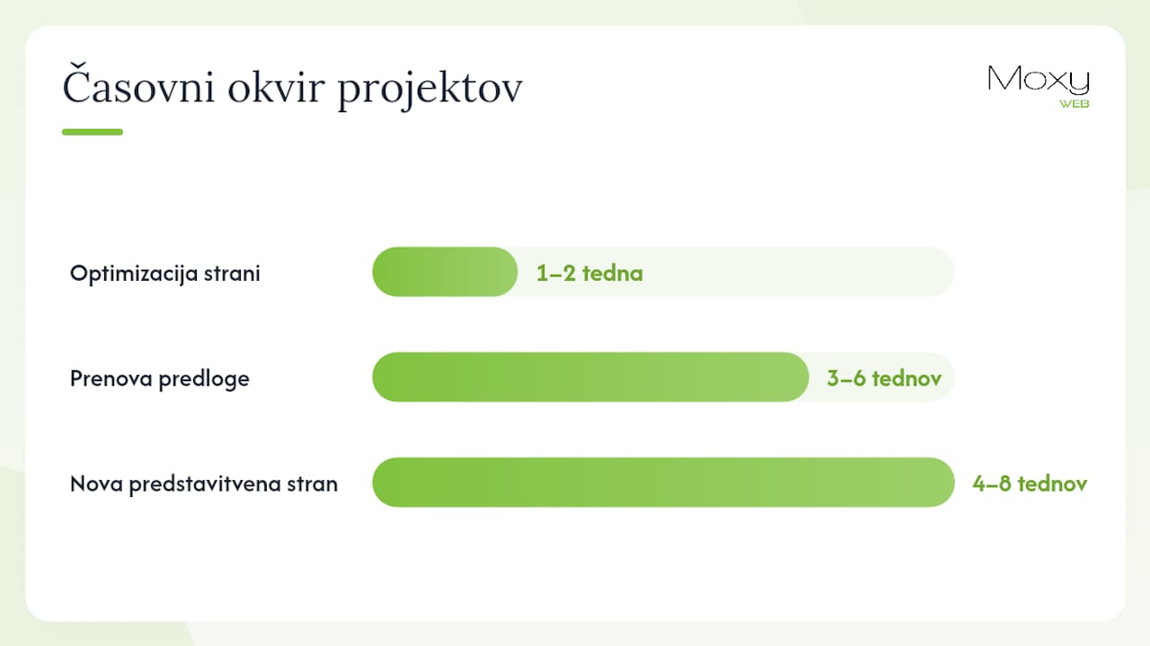
The scope of a project determines its timeline and cost. Basic optimization of an existing site is a different project than building an entirely new one.
| Type of project | Approximate timeline | Approximate cost |
|---|---|---|
| Optimizing an existing site (Core Web Vitals, images, CSS) | 1-2 weeks | an approximate cost |
| Redesigning the template with a mobile-first approach | 3-6 weeks | an approximate cost |
| A new custom-built brochure site | 4-8 weeks | an approximate cost |
| An online store or complex application | an approximate timeline | an approximate cost |
Costs are approximate and vary based on complexity, integrations, and content volume. What the client can prepare in advance to reduce costs:
- Content that's already gathered and organized (copy, images, logos) before development starts.
- Clearly defined feature priorities (what the site absolutely needs to do).
- A decision on the CMS and any integrations with external systems.
For a broader look at digital strategy, check out the key steps for a company's digital presence.
How to choose a provider for mobile adaptation
Choose a provider who understands the mobile-first approach and measures Core Web Vitals - not just one who shows you nice screenshots.
Questions to ask before signing a contract:
- Do you have experience with a mobile-first project? Show an example with before-and-after measurements.
- Which metrics do you measure at handover (LCP, CLS, INP)?
- How do you test on physical devices, not just in a browser?
- What's your process after launch - when and how do you verify the site is working correctly?
- What's the SLA for speed and security after launch?
Red flags to watch for:
- The provider only shows visual mockups, with no performance data.
- Testing happens only in Chrome DevTools, with no real devices.
- There's no clear plan for measuring Core Web Vitals after launch.
- The SLA for speed and security isn't defined in the contract.
How Moxy-web approaches mobile responsiveness
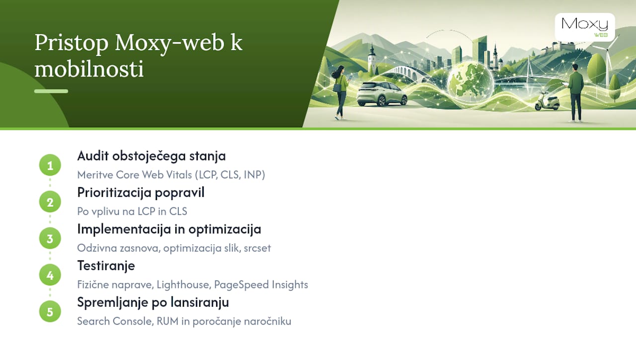
Moxy-web runs projects on a mobile-first basis, from the first sketch through to launch. The process runs in five steps: auditing the current state with Core Web Vitals measurement, prioritizing technical fixes by their impact on LCP and CLS, implementation with responsive design and image optimization, testing on physical devices and with Lighthouse and PageSpeed Insights, and ongoing monitoring after launch through Search Console and RUM.
For a typical redesign project, Moxy-web measures LCP, CLS, and INP before starting and after launch, and reports the achieved values back to the client. Checkpoints include reviewing breakpoints at three resolutions, checking the srcset implementation, and an accessibility audit against the WCAG 2.1 guidelines. Accessibility isn't a separate topic - it's part of mobile responsiveness, since requirements around contrast, font size, and keyboard navigation directly improve the mobile experience. You can find more on the approach to SEO strategy for businesses in a separate guide.
Key takeaways
Mobile responsiveness is the technical and strategic foundation of every modern website, directly determining Google rankings, load speed, and conversion rate.
| Point | Details |
|---|---|
| Google's mobile-first indexing | The mobile version of a site determines rankings - the technical quality of the mobile site is an SEO priority. |
| Slovenian statistics | SURS (2025): 92% of people aged 16-74 use the internet; most via mobile devices. |
| Core Web Vitals | LCP under 2.5s, CLS under 0.1, and INP under 200ms are measurable goals that affect conversions. |
| Testing tools | Lighthouse, PageSpeed Insights, and Google Search Console are mandatory tools for every project. |
| Moxy-web | Runs mobile-first projects with Core Web Vitals measurement before and after launch, plus ongoing monitoring. |
Mobile-first isn't a trend - it's a fundamental companies still underestimate
Most companies commissioning a website redesign ask: "Will the site look nice on a phone?" The real question is: "Will the site on a phone perform fast, correctly, and without the errors Google penalizes?"
The difference between these two questions is the difference between visual adaptation and genuine mobile optimization. A site that looks great in a Figma prototype but takes six seconds to load on an average Slovenian 4G connection won't even make it to the first page of Google. Clients who understand this before signing a contract get better results - because they know to ask for the right things and how to verify they've been delivered.
My recommendation: include measurable Core Web Vitals targets in every website development contract as a condition for acceptance. Not as a suggestion, but as an obligation.
Moxy-web helps you from audit to launch
For companies commissioning a new site or a redesign, Moxy-web offers a comprehensive approach: from an initial mobile performance audit to development with responsive design, Core Web Vitals optimization, and ongoing technical monitoring after launch. Every project starts with measuring the current state - so you know exactly where you stand and what will have the biggest impact.
Unlike generic agencies that offer a template and adapt it, Moxy-web builds every solution custom to the client, with clear milestones and measurable results. Recommendations for mobile local landing pages show that a locally adapted mobile page significantly increases the number of inquiries from mobile search.
For a free review of your mobile performance or a redesign quote, get in touch with Moxy-web.
Useful resources and references
For your own review and for briefing a provider, the following resources are useful:
- SURS: Internet use in households and among individuals, 2025 - Slovenian statistics supporting the business case for mobile optimization.
- SURS: Access via mobile devices, 2007-2019 - historical data on the context of growing mobile use in Slovenia.
- SURS: Smart device use in Slovenia - data on smart devices and usage challenges.
- SEO-praktik: Mobile optimization - a practical guide to mobile-first indexing and Core Web Vitals.
- Ranktracker: SEO and UX in 2025 - arguments for aligning SEO with user experience.
- Ranktracker: Responsive design for e-commerce - the impact of mobile responsiveness on online stores.
- Mama.Over.Net: Internet use in Slovenia (SURS) - a current confirmation of high mobile usage in Slovenia.
For your own audit, start with Google PageSpeed Insights (free, no registration) and the Search Console mobile usability report - both tools show you within minutes where your site is falling short.
Frequently asked questions
What is website mobile responsiveness?
Mobile responsiveness means a website displays correctly, both technically and visually, and loads quickly on all mobile devices. It includes responsive design, image optimization, correctly sized touch targets, and achieving good Core Web Vitals scores.
Why does Google penalize sites without mobile optimization?
Since 2019, Google has indexed sites based on their mobile version. A site with poor LCP, high CLS, or slow loading on mobile devices gets lower rankings, regardless of how good the content is on the desktop version.
Which metrics matter most for mobile optimization?
LCP (under 2.5s), CLS (under 0.1), and INP (under 200ms) are the three key Core Web Vitals metrics that Google measures and that directly affect rankings and conversions.
How long does a mobile website redesign take?
Basic optimization of an existing site takes 1-2 weeks, a template redesign 3-6 weeks, and a new custom-built site 4-8 weeks or more, depending on complexity.
How does Moxy-web ensure the quality of mobile adaptation?
Moxy-web measures Core Web Vitals before starting and after launch, tests on physical devices, and reports the achieved LCP, CLS, and INP values to the client as part of project handover.