Best Methods for Website Usability Testing
8 min read
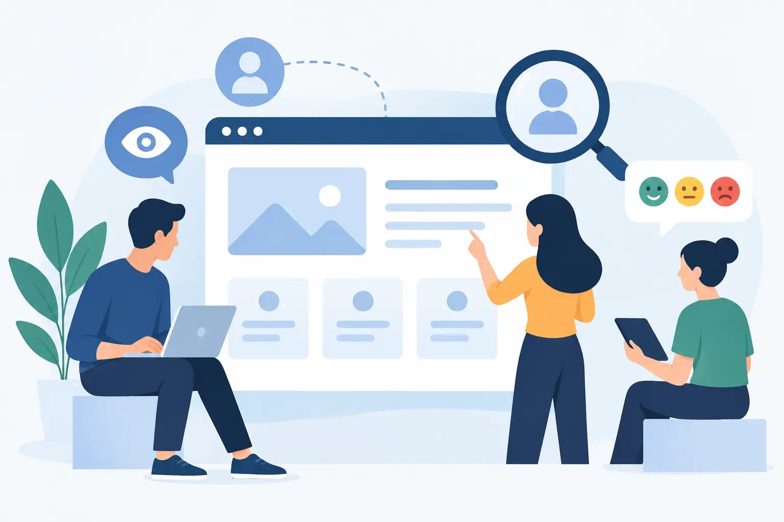
A visitor who can't find the delivery cost in an online store, can't submit an inquiry in three steps, or misses the buy button on their phone doesn't need more patience. They need a better web experience. The best usability testing methods show exactly where a user gets stuck, what confuses them, and which changes actually move the needle for the business.
Attractive design and a technically flawless build are essential, but on their own they don't guarantee results. A website needs to clearly guide a visitor toward their goal: a purchase, an inquiry, booking an appointment, logging in, or accessing information. Usability testing isn't about hunting for bugs for their own sake. It's about verifying that the web solution supports the way your customers actually think and decide.
What usability testing actually measures
Usability isn't a matter of personal taste. We measure it through concrete questions: does the user understand the offer, do they quickly find the right information, can they complete a key task, and do they trust the business while doing so? If a visitor has to guess where to click, or has to go back to the start, the path is too long — no matter how good the page looks.
For a business website, it makes sense to start with tasks that have direct value. For a service business, that might be finding the right service and submitting an inquiry. For an online store, it's choosing a product, checking delivery, and completing a purchase. For a web application, we often check login, entering data, working with a dashboard, or a connection to another business system.
Good testing answers two different questions. The first is what the user does. The second, far more important one, is why they do it. Analytics might show you that a lot of people abandon their cart. A conversation with a user might reveal that they couldn't find the delivery time, didn't understand the package options, or didn't trust the payment form.
The best usability testing methods, by goal
No single method solves everything. The right choice depends on the project's stage, the type of web solution, and the question you want answered. The most effective approach usually combines quick qualitative checks with behavioral data from a broader group of visitors.
Moderated user testing
In a moderated test, a user performs pre-prepared tasks while a researcher observes and asks brief follow-up questions. It can run live or via video call. An example task is simple: "Find the service you need and submit an inquiry for a rough quote."
The advantage of this method is direct insight into the user's thinking. When someone gets stuck navigating or overlooks an important button, you can immediately tell whether the issue is wording, layout, content, or trust. This kind of test is especially useful before launching a new website, redesigning a store, or rolling out a feature that's critical to the business.
You don't need a huge number of participants to spot obvious obstacles. Just five to eight people from the right target group often reveal recurring issues. That doesn't mean five users is always enough, though. If you're addressing very different groups — wholesale buyers, end consumers, and partners, say — you need to test each group's experience separately.
Unmoderated testing for faster validation
In unmoderated testing, users complete tasks independently, with no researcher present. The system logs task success, time spent, clicks, and often a screen recording too. This approach lets you gather more responses faster, and it's practical when you want to compare two versions of a page or check a clearly defined user flow.
Its limitation is less context. You'll see that a user abandoned a task, but you won't always know whether they were thrown off by the text, their phone, an unclear price, or simply a lack of interest. That's why unmoderated testing is strongest when you already know the key questions and want to verify whether a change genuinely improves the path to the goal.
First-click testing and navigation checks
The first click often determines whether a user successfully completes a task. If someone clicks "About Us" instead of "Services" while looking for a price list, the problem isn't the user. The navigation or labels aren't clear enough.
First-click testing is fast and cost-effective for checking a homepage, the main menu, landing pages, and content-heavy structures. It's especially useful for businesses with a large range of services, products, or documentation. It lets you fix the structure before spending time and development budget on it.
When we're checking information architecture alone, we also use a tree-testing approach. A user searches for specific content in a text-only version of the menu, with no visual design. This quickly separates two things: whether the problem lies in the content structure or in the page's visual design.
Session recordings, heatmaps, and analytics
Data on real visitors is invaluable, but it needs to be read carefully. Heatmaps show where visitors click and how far they scroll down a page. Session recordings can reveal repeated clicks, going back and forth between steps, or unusual mouse movement. Analytics shows which pages people leave from and which channels bring in higher-quality visits.
These are excellent tools for spotting patterns, not for guessing reasons. A lot of clicks on an element doesn't necessarily mean it's working well. Visitors might be clicking it because they mistake it for a link. Similarly, a long time spent on a page isn't necessarily a sign of interest — it can mean a visitor doesn't understand the offer.
You get the best results when you verify a data signal with a user test. If recordings show people repeatedly opening the FAQ page before purchasing, it's worth checking what information is missing right on the product page or in the cart.
A/B testing to confirm business impact
A/B testing compares two versions of the same page or element across comparable groups of visitors. You can test a different headline, a different order of information, a form, how a price is displayed, or a call-to-action button. Its advantage is a measurable business outcome: which version generates more submitted forms, purchases, or bookings.
But an A/B test isn't a substitute for user research. You need enough traffic, a clearly stated hypothesis, and enough time for a reliable result. For a website with lower traffic, a test can run too long or produce misleading conclusions. In that case, moderated testing and user-journey analysis are often a more sensible first step.
How to design a test that produces useful decisions
The biggest mistake is testing without a clear business question. Instead of a vague question like "Does the user like the site?", define a specific dilemma: Do visitors understand the difference between packages? Can a customer complete an order without help? Can a business owner quickly find evidence of our track record and expertise?
Design tasks realistically, without hinting at the answer. Don't tell the user: "Click the inquiry form." Instead, put them in a situation: "You want a quote for redesigning your online store. Show us how you'd get in touch with the business." If your instructions reveal the solution, you're not testing usability — you're testing their ability to follow instructions.
While observing, don't jump to defend the design and don't help too quickly. Silence during a test is often the most valuable part. A user spending a few seconds searching for the next step tells you more than ten general comments about how nice the design looks. Record task success, time, obstacles, the words they use, and moments of hesitation.
After the test, don't rank issues only by how many people mentioned them. Also weigh their impact. A mistake that prevents three users from submitting an inquiry matters more than an aesthetic comment ten people made. Priority goes to obstacles in the sales path, pricing ambiguity, payment problems, broken mobile features, and elements that undermine trust.
Mobile usability and accessibility aren't optional extras
A large share of your visitors will open your site on their phone, often during a short break, on the move, or right before deciding. That's why it's essential to test on real mobile devices, not just a shrunk-down browser window. Check button size, readability, forms, the keyboard, loading speed, and access to the most important information without unnecessary scrolling.
Accessibility, at the same time, improves the experience for a much broader group of people. Good contrast, meaningful form labels, clear headings, understandable error messages, and keyboard control aren't bureaucratic details. They reduce friction for users with limitations, older visitors, people in poor lighting conditions, and anyone using a website quickly and without patience.
With custom-built solutions, testing findings can be fed directly into design, development, and connections to external systems. If users don't understand an order status, the problem might not be the interface alone — it might also be how the online store receives data from the logistics or accounting system. That's exactly why usability needs to be treated as part of the entire digital solution, not a final check before launch.
The best website isn't the one that asks users to adapt to it. It's the one that lets them confidently and quickly do what they came to do. Start with one key task, watch real users, and fix the biggest obstacle — that's often where the fastest path to better results is hiding.